Mobile-First or Missed Customers: Why Responsive Websites Win Today
Mobile-First or Missed Customers
Why Responsive Websites Quietly Outperform Everything Else
Most businesses think customers judge them on their products.
In reality, customers judge them on how annoying their website feels on a phone.
We browse the internet in queues, on sofas, on job sites, in cars (hopefully as passengers), and — most dangerously — during meetings we’re pretending to pay attention to.
This is why the majority of all browsing now happens on handheld screens.
To ignore mobile users today is to politely turn away half your potential customers.
1. The World Has Already Shifted to Mobile
More than 63% of global traffic now comes from mobile devices, and even in Europe — where people still love desktop workflows — 53% of browsing happens on phones.
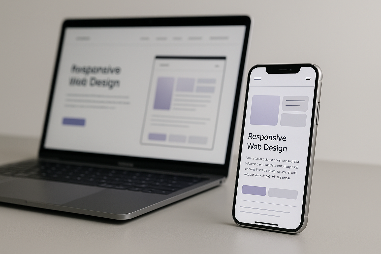
A modern website doesn’t just “work” on mobile.
It feels natural on mobile.
A website that forces users to pinch, zoom, or tilt their phone may as well be a locked door with a sign that says:
“Please come back when you’re on a laptop.”
Most people won’t.
2. The Psychology: Friction = Lost Revenue
People don’t consciously leave a badly designed mobile site —
they drift away from it, quietly, effortlessly, like water finding a downhill path.
This is the danger:
tiny annoyances create enormous changes in customer behaviour.
Consider the data:
- 73% of visitors leave instantly if the site isn’t mobile-friendly.
- 57% refuse to recommend a business after a bad mobile experience.
- Users are 68% more likely to stay longer when the mobile experience “just feels right.”
A responsive design doesn’t change your business.
It changes how your business feels — the most underrated competitive advantage.
3. The Numbers: Mobile-First Makes More Money
When companies redesign their websites to be mobile-first, something interesting happens:
Sales go up.
Conversions go up.
Leads go up.
Here are the concrete results:
- Walmart Canada:
+20% conversions
+98% mobile orders - E-commerce brand (CRO project):
+70% more orders - Industrial B2B supplier:
+250% more leads - General market data:
Mobile-optimized sites see ~40% higher conversion rates
62% of businesses report higher sales after moving to responsive design
These aren’t marketing miracles.
They’re simply what happens when customers stop struggling to interact with you.
Responsiveness removes effort.
Removing effort increases action.
4. Even “Traditional” Industries Need Mobile-First
Many companies believe:
“Our clients aren’t mobile users.”
Yet procurement managers, factory supervisors, logistics coordinators, and B2B buyers all spend half their research time on their phones — usually in transit, on worksites, or between tasks.
Your competitors may still be running websites built a decade ago.
A modern, mobile-first experience instantly signals:
- efficiency
- professionalism
- trustworthiness
- ease of doing business
In industries slow to adopt digital improvements, a responsive site is not a luxury — it’s a strategic advantage.
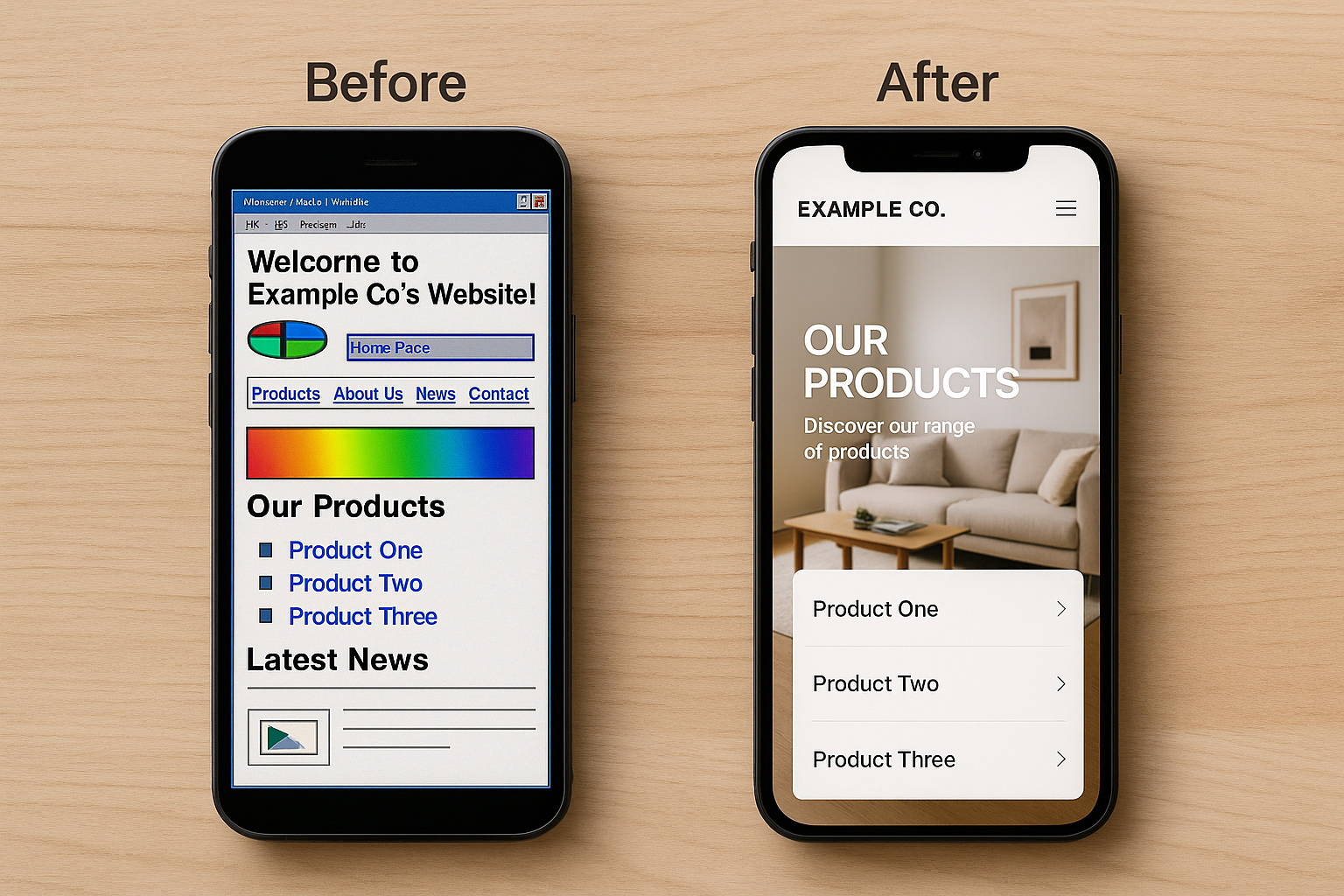
The difference between a desktop-only site and a mobile-first design isn’t subtle.
Conclusion: A Mobile-First Website Pays for Itself
Choosing a responsive, mobile-first website:
- boosts conversions
- increases Google visibility
- improves user trust
- reduces bounce rates
- lifts sales
- makes your business feel effortless
It’s one of the few upgrades where:
The smallest change in experience produces the largest change in results.
When more than half of your visitors arrive on a 6-inch screen, you want that screen to welcome them — not frustrate them.
A mobile-first site does exactly that.


